Category: analysis

Yellow submarine

Years ago, I remember taking a tour of what was then one of those newfangled “innovation labs”.

A hive of Design Thinking, it was crawling with serious young people in jeans and t-shirts scribbling on walls and rearranging herds of post-it notes.

In an otherwise old-fashioned financial services organisation, it was an impressive tilt towards modernisation and true customer centricity (beyond the warm and fuzzy TV commercials).

After our guide had finished explaining this brave new world to the group, one of us asked him to share a project he’d been working on. He proudly explained how the year prior, the lab had applied the progressive methodology to the development of a new product which had, finally, launched.

Which begged the next question… How many new customers did it sign up? His straight-faced answer: Seven.

Seven!

For a bank with literally millions of customers, this was astounding. And he didn’t seem all that bothered by it. The apparent solution was to go back to the drawing board and try again.

While still doing the math in my head to calculate the negative return on investment, I stumbled upon the myth of The Yellow Walkman. I neither confirm nor deny its veracity, but Alexander Cowan recounts it as follows in his article Yellow Walkman Data & the Art of Customer Discovery:

Close-up of a yellow Walkman

Sony’s conducting a focus group for a yellow ‘sport’ Walkman. After assembling their ‘man/woman on the street’ contingent, they ask them ‘Hey, how do you like this yellow Walkman?’ The reception’s great. ‘I love that yellow Walkman – it’s so sporty!’ ‘Man, would I rather I have a sweet yellow Walkman instead of a boring old black one.’

While everyone’s clinking glasses, someone had the insight to offer the participants a Walkman on their way out. They can choose either the traditional black edition or the sporty new yellow edition – there are two piles of Walkmans on two tables on the way out. Everyone takes a black Walkman.

It’s an old story, but its message remains relevant today. Because humans are terrible at predicting their own behaviour.

You see, talk is cheap. Everyone has great ideas… when someone else has to implement them. And if you ask someone point blank if they want something, nine times out of ten they’ll say yes. Then they never use it and you’re left carrying the can wondering where you went wrong.

We see this kind of thing all the time in workplace learning and development. Someone in the business will demand we build an online course, which no one will launch; or a manager will pull a capability out of thin air, oblivious to the real needs of their team.

As Cowan suggests, this can be mitigated by thoughtful questioning that avoids the solution-first trap. And of course the point of the MVP approach that’s championed by Design Thinking minimises any losses by failing fast.

But we can do something else before we get to that point: validate.

In the yellow Walkman example, Cowan offers:

Sony’s product designer mocks up several colors of Walkman and puts together some kind of an ordering page with the options. Focus group subjects (or just online visitors) are allowed to pre-order what they want. This gets you the same result without having to actually produce a whole bunch of yellow (or whatever) Walkmans.

In the L&D context, I suggest complementing our TNA consultations with assessments. So the team needs to develop x capability? Test it. They’re all over y competency? Test it.

And it needn’t be expensive nor onerous. A micro-assessment approach should be sufficient to expose the blindspots.

By validating your qualitative data with quantitative data, you’re building extra confidence into your bet and maximising its probability of success.

Lest it sink like a yellow submarine.

The sum of us

What is the definition of the term “data scientist”…?

In my previous post, Painting by numbers, I offered a shorthand definition of data science based on what I could synthesise from the interwebs. Namely, it is the combination of statistics, computer programming, and domain expertise to generate insight. It follows, then, that the definition of data scientist is someone who has those skill sets.

Fat chance!

In this post I intended to articulate my observation that in the real world, incredibly few people could be considered masters of all three disciplines. I was then going to suggest that rather than seeking out these unicorns, employers should build data science teams comprising experts with complementary talents. I say “was” because I subsequently read this CIO article by Thor Olavsrud in which he quotes Bob Rogers saying, well… that.

Given Thor and Bob have stolen my thunder (18 months ago!) I think the only value I can add now is to draw a parallel with pop culture. So I will do so with the geeky HBO sitcom Silicon Valley.

The cast of Silicon Valley: Dinesh, Gilfoyle, Richard, Jared and Erlich.

If you aren’t familiar with this series, the plot revolves around the trials and tribulations of a start-up called Pied Piper. Richard is the awkward brainiac behind a revolutionary data compression algorithm, and he employs a sardonic network engineer, Gilfoyle, and another nerdy coder, Dinesh, to help bring it to market. The other team members are the ostentatious Erlich – in whose incubator (house) the group can work rent-free in exchange for a 10% stake – and Jared, a mild-mannered economics graduate who could have been plucked from the set of Leave It to Beaver.

The three code monkeys are gifted computer scientists, but they have zero business acumen. They are entirely dependent on Jared to write up their budgets and forecasts and all the other tickets required to play in the big end of town. Gilfoyle and Dinesh’s one attempt at a SWOT analysis is self-serving and, to be generous, NSFW.

Conversely, Jared would struggle to spell HTML.

Arguably the court jester, Erlich, is the smartest guy in the room. Despite his OTT bravado and general buffoonery, he proves his programming ability when he rolls up his sleeves and smashes out code to rescue the start-up from imploding, and he repeatedly uses his savvy to shepherd the fledgling business through the corporate jungle.

Despite the problems and challenges the start-up encounters throughout the series, it succeeds not because it is a team of unicorns, but because it comprises specialists and a generalist who work together as a team.

Purple Unicorn, courtesy of Wild0ne, Pixabay.

And so the art of Silicon Valley shows us how unlikely we would be in real-life to recruit an expert statistician / computer programmer / business strategist. Each is a career in its own right that demands years of education and practice to develop. A jack-of-all-trades will inevitably be a master of none.

That is not to say a statistician can’t code, or a programmer will be clueless about the business. My point is, a statistician will excel at statistics, a computer programmer will excel at coding, while a business strategist will excel at business strategy. And I’m not suggesting the jack-of-all-trades is useless; on the contrary, he or she will be the glue that holds the specialists together.

So that begs the question… which one is the data scientist?

Since each is using data to inform business decisions, I say they all are.

Painting by numbers

A lifetime ago I graduated as an environmental biologist.

I was one of those kids who did well in school, but had no idea what his vocation was. As a pimply teenager with minimal life experience, how was I to know even half the jobs that existed?

After much dilly dallying, I eventually drew upon my nerdy interest in science and my idealistic zeal for conservation and applied for a BSc. And while I eventually left the science industry, I consider myself extremely fortunate to have studied the discipline because it has been the backbone of my career.

Science taught me to think about the world in a logical, systematic manner. It’s a way of thinking that is founded on statistics, and I maintain it should inform the activities we undertake in other sectors of society such as Learning & Development.

The lectures I attended and the exams I crammed for faded into a distant memory, until the emergence of learning analytics rekindled the fire.

Successive realisations have rapidly dawned on me that I love maths and stats, I’ve floated away from them over time, the world is finally waking up to the importance of scientific method, and it is high time I refocused my attention onto it.

So it is in this context that I have started to review the principles of statistics and its contemporary manifestation, analytics. My exploration has been accompanied by several niggling queries: what’s the difference between statistics and analytics? Is the latter just a fancy name for the former? If not, how not?

Overlaying the post-modern notion of data science, what are the differences among the three? Is a data scientist, as Sean Owen jokingly attests, a statistician who lives in San Francisco?

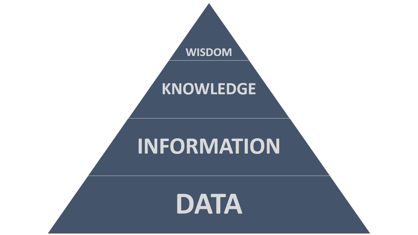
The DIKW Pyramid

My journey of re-discovery started with the DIKW Pyramid. This beguilingly simple triangle models successive orders of epistemology, which is quite a complex concept. Here’s my take on it…

The DIKW Pyramid, with Data at the base, Information a step higher, Knowledge another step higher, and Wisdom at the peak.

At the base of the pyramid, Data is a set of values of qualitative or quantitative variables. In other words, it is the collection of facts or numbers at your disposal that somehow represent your subject of study. For example, your data may be the weights of 10,000 people. While this data may be important, if you were to flick through the reams of numbers you wouldn’t glean much from them.

The next step up in the pyramid is Information. This refers to data that has been processed to make it intelligible. For example, if you were to calculate the average of those ten thousand weights, you’d have a comprehensible number that is inherently meaningful. Now you can do something useful with it.

The next step up in the pyramid is Knowledge. To avoid getting lost in a philosophical labyrinth, I’ll just say that knowledge represents understanding. For example, if you were to compare the average weight against a medical standard, you might determine these people are overweight.

The highest step in the pyramid is Wisdom. I’ll offer an example of wisdom later in my deliberation, but suffice it to say here that wisdom represents higher order thinking that synthesises various knowledge to generate insight. For example, the wise man or woman will not only know these people are overweight, but also recognise they are at risk of disease.

Some folks describe wisdom as future focused, and I like that because I see it being used to inform decisions.

Statistics

My shorthand definition of statistics is the analysis of numerical data.

In practice, this is done to describe a population or to compare populations – that is to say, infer significant differences between them.

For example, by calculating the average weight of 10,000 people in Town A, we describe the population of that town. And if we were to compare the weights of those 10,000 people with the weights of 10,000 people in Town B, we might infer the people in Town A weigh significantly more than the people in Town B do.

Similarly, if we were to compare the household incomes of the 10,000 people in Town A with the household incomes of the 10,000 people in Town B, we might infer the people in Town A earn significantly less than the people in Town B do.

Then if we were to correlate all the weights against their respective household incomes, we might demonstrate they are inversely proportional to one another.

The DIKW Pyramid, showing statistics converting data into information.

Thus, our statistical tests have used mathematics to convert our data into information. We have climbed a step up the DIKW Pyramid.

Analytics

My shorthand definition of analytics is the analysis of data to identify meaningful patterns.

So while analytics is often conflated with statistics, it is indeed a broader expression – not only in terms of the nature of the data that may be analysed, but also in terms of what is done with the results.

For example, if we were to analyse the results of our weight-related statistical tests, we might recognise an obesity problem in poor neighbourhoods.

The DIKW Pyramid, showing analytics converting data into knowledge.

Thus, our application of analytics has used statistics to convert our data into information, which we have then translated into knowledge. We have climbed another step higher in the DIKW Pyramid.

Data science

My shorthand definition of data science is the combination of statistics, computer programming, and domain expertise to generate insight. Or so I’m led to believe.

Given the powerful statistical software packages currently available, I don’t see why anyone would need to resort to hand coding in R or Python. At this early stage of my re-discovery, I can only assume the software isn’t sophisticated enough to compute the specific processes that people need.

Nonetheless, if we return to our obesity problem, we can combine our new-found knowledge with existing knowledge to inform strategic decisions. For example, given we know a healthy diet and regular exercise promote weight loss, we might seek to improve the health of our fellow citizens in poor neighbourhoods (and thereby lessen the burden on public healthcare) by building sports facilities there, or by subsidising salad lunches and fruit in school canteens.

The DIKW Pyramid, showing data science converting data into wisdom.

Thus, not only has our application of data science used statistics and analytics to convert data into information and then into knowledge, it has also converted that knowledge into actionable intelligence.

In other words, data science has converted our data into wisdom. We have reached the top of the DIKW Pyramid.

Facts are a bitch

This morning I posted the following question to Twitter:

What do you think of Parrashoot as the name of a local photography competition in Parramatta?

The word play is genius, no?

A man using a camera.

Now, for those of you who don’t know, Parramatta is the cosmopolitan sister city of Sydney, approximately 23 kilometres (14 miles) west of the Harbour Bridge.

Due to its geographical location and its colourful history, it is often put down by yuppies and wanna-be’s, and is typically lumped into the broad, vague and lazy category “Sydney’s West” which features prominently on the nightly news.

While this view of my local area is about 25 years out of date (and perhaps a little racist?) it doesn’t seem to affect its prevalence.

Anyway, among the replies I received to my tweet was one that linked the fragment “shoot” to homicide. It’s clear the guy was joking, but it got me thinking…

Being the geek I am, I looked up the state’s crime statistics and graphed the homicides recorded by the police from 1995 through to 2009:

Graph of homicides recorded by NSW Police from 1995 through to 2009.

The results are intriguing – not only because the figures are incredibly low for a major metropolis.

Notice how Inner Sydney (the CBD and surrounds) tops the list with 156 reports, followed by Fairfield-Liverpool (southwestern suburbs), then the Hunter (northern wine & coal region), Canterbury-Bankstown (inner southwestern suburbs), Illawarra (south coast) and the Mid North Coast.

Eventually Central West Sydney (which includes Parramatta) makes an appearance with 66 reports, while – hang on! – the well-heeled Eastern Suburbs rounds out the Top 10 with 52 reports.

Oh, my. That’s enough to make oneself gag on one’s latte.

So what’s this got to do with learning?

In the workplace, how often do we L&D professionals make assumptions that simply aren’t true?

I’ll hazard a guess: too often.

My point is, we should endeavour to back up our assumptions with evidence.

  • What are the learning priorities of the business?
  • What is the most effective mode of delivery?
  • Is Gen-Y collaborative?
  • Are baby boomers technophobic?
  • Does that expensive leadership course improve performance?
  • Are our people incapable of self-directed learning?

These are just some of the many questions that we really should answer with data.

Otherwise we may find ourselves about 25 years out of date.

Analyse This

From the instructional designer’s point of view, the term “Analysis” fulfils the “A” in the ADDIE Model, which in turn forms the backbone of Instructional Systems Design (ISD).

ADDIE Process: Analysis, Design, Development, Implementation, Evaluation.

What is analysis?

Big Dog & Little Dog provide an excellent Instructional System Design Manual that covers analysis quite comprehensively. However the basics are really straightforward.

I like their description of analysis which they attribute to Allison Rossett:

Analysis is the study we do in order to figure out what to do.

Because that’s exactly what it is. It’s the foundation of all subsequent development activity.

There’s no point launching into a frenzy of work unless you know why you’re doing it. Otherwise your efforts are liable to go to waste, and where’s the value-add in that?

Focus on performance

When conducting a needs analysis in the workplace, it’s important to focus on performance. Not training, not learning, not development… performance.

Your red flag is the Performance Gap, which is the difference between what the level of performance is now, and what it should be.

You need to determine why the gap exists, then design a solution to fix it.

That solution may be training or learning or development, or something else altogether. It may be simple or complex, online or face-to-face, real-time or asynchronous.

It all depends on the nature of the problem.

Data

There are two major approaches to identifying performance gaps:

  1. Reactive, and
  2. Proactive.

The reactive approach responds to your customer (or someone else) telling you what they need. For example, a Team Leader might call you to say that her team is struggling to meet its productivity targets; or a Project Manager might inform you of the imminent rollout of a new processing system. In either case, you need to react to that information.

While the reactive approach is vitally important, the proactive approach is arguably more important in today’s environment. By adopting a proactive approach, you don’t simply wait for your customer to tell you what their needs are – you find out for yourself.

This kind of analysis relies heavily on data. The data may be subjective, for example:

  • Consultation
  • Conversation
  • Qualitative survey
  • Focus group

Or it may be objective, for example:

  • Productivity statistics
  • Quality statistics
  • Complaints register
  • Compliance report
  • Skills matrix

The data provides the evidence to support what you’re going to do next.

It gives you the confidence that your work will hit the mark and, ultimately, improve the overall performance of the business.

Root cause analysis

When analysing the data, I recommend that you be suspicious, but fair.

For example, if a graph shows that a certain individual is struggling with his productivity score, then yes: suspect that person may be experiencing an issue that’s hindering their performance.

Bear in mind, however, that a myriad of reasons may be influencing the result. Maybe they’re new to the role; maybe they’re sick or burnt out; maybe they’re constantly bombarded all day by their peers. Always consider the conditions and the circumstances.

But at the end of the day, the numbers don’t lie, so you need to do something. Sometimes training is the answer, sometimes it isn’t. Maybe a flawed process needs to be modified; maybe a pod reshuffle is in order; maybe someone just needs a holiday.

Whatever you do, make sure you address the root of the problem, not just the symptoms.