Tag: knowledge management

Introducing the Social Intranet Index

There’s a lot of talk about social intranets these days. It even threatens to overtake the blogosphere’s current obsession with gamification.

But what exactly is a social intranet…?

Everyone seems to have a different opinion, from a human-centred platform, to the intersection between portals, team sites and social sites, to a system that ties the business’s processes and data to the employee’s social behaviour.

Which one is correct? They all are.

You see, a “social intranet” is simply an intranet with social media elements that allow the users to interact with the content and with each other.

While everyone’s definition covers this functionality more or less, what is different is the degree of the functionality.

So, to introduce a common language and some standardisation to our discourse, I propose the “Social Intranet Index” (SII) – a metric that denotes the degree of social functionality afforded by an enterprise’s intranet.

From 1 through 10, the SII represents an increasing level of sociability…

Smile Clusters

1

An intranet with an SII of 1 is the traditional, old-fashioned broadcast medium. Its content is published by a select few (usually members of the Communications team) and remains read-only for the target audience.

2

An intranet with an SII of 2 accommodates special account holders outside of the golden circle. These are typically highly motivated individuals, because the backend is clunky and illogical.

Unfortunately these individuals tend to find themselves in the unenviable position of publishing content for other people, because said people are either too dumb or too lazy to learn how to do it themselves. Strangely, though, they all know how to use Facebook.

3

An intranet with an SII of 3 introduces a star rating or a “like” facility. The target audience can interact (albeit minimally) with the content by judging its quality and relevance.

4

An intranet with an SII of 4 introduces a commenting facility. Beyond a reductionist score, the target audience can now post free-form comments in response to the content.

5

An intranet with an SII of 5 bolts on third-party social applications such as Yammer, Compendium and Confluence. While these apps aren’t components of the enterprise’s intranet proper, they’re accessible from there and thus form part of the network. The target audience is empowered to generate their own content within these ringfenced zones.

6

An intranet with an SII of 6 integrates social media elements such as a discussion forum, blogs and wikis into a single sign-on solution. The user experience is seamless.

7

An intranet with an SII of 7 maintains a bank of user profiles that includes everyone in the organisation and is accessible by anyone in the organisation. The profiles are rich (including photos, contact details and subject matter expertise) and integrate with the other components of the intranet (eg the discussion forum) to facilitate social networking.

8

An intranet with an SII of 8 enables the users to personalise the interface. This typically involves the selection and arrangement of social widgets (eg a particular blog, a discussion sub-forum), a filterable activity stream, plus external functionality such as a customisable RSS feed.

9

An intranet with an SII of 9 empowers anyone in the organisation to publish and edit “regular” informational content beyond the aforementioned social media elements, though still within certain ringfenced zones. For example, a team site may host user-generated content pertinent to that team.

10

An intranet with an SII of 10 is the poster boy of heterarchy. All content is easily publishable and editable by everyone in the organisation. Devoid of ringfences, the platform effectively becomes a giant wiki. The corporate community pitches in to produce and maintain organic knowledge.

Outlandish and unworkable, or innovative and game changing? At the very least, I say an SII of 10 is aspirational.

Concurrent trends associated with the Social Intranet Index.

From 1 to 10, the Social Intranet Index represents a series of concurrent trends.

Most radically, the direction of publishing shifts from one-way to two-way to multi-way. This is typically associated with an increasing ease of use, which in turn encourages an increasing number of content producers.

Knowledge contained in silos is increasingly shared, and a broader community blossoms. As governance loosens, the organisation puts more trust in its own employees. Effectively, its hierarchy flattens.

As more control is relinquished by the company to its people, however, the risk of something going wrong increases. The content that is generated by the users might be flawed, and in extreme cases an individual might abuse their privileges and do something malicious.

On the other side of the coin, though, loose governance does not mean no governance. Sensitive content may still be locked, while an approval process and a reversion facility can prevent disaster.

Moreover, it may be argued that the shifting paradigm places an increasing obligation on the SME not only to share their knowledge with the wider organisation, but also to maintain its currency and relevance. Those who can’t or won’t will soon get found out.

Man looking at his laptop.

Clearly, a “social intranet” is not just about the technology; it’s about the culture of the organisation. Just because sophisticated functionality is available does not necessarily mean it will be used!

Notwithstanding this truism, I submit that culturally speaking, an SII of 1 is poles apart from an SII of 10. The former is characteristic of a restrictive, distrustful, clunky organisation, while the latter is characteristic of an open, empowering, nimble one.

Which organisation do you think will be more collaborative?

Which one is more adaptable to change?

Which one will ultimately perform better in the market?

Closer to home, what is the SII of your organisation’s intranet…?

2010: My blogging year recapped

As 2010 draws to a close, I thought I’d take a moment to recap my blog posts during the year.

I hope you take the opportunity to read any that you may have missed.

Oh, and please leave a comment or two or three…!

Tag cloud for the E-Learning Provocateur blog in 2010.

Learning theory & instructional design

•  Taxonomy of Learning Theories
•  Theory-informed instructional design tips
•  The two faces of blended learning
•  Style counsel
•  Art vs (Information) Science

Informal learning

•  My award-winning IQ
•  Online courses must die!
•  The ILE and the FLE in harmony
•  How to revamp your learning model
•  Open Learning Network vs ILE

Social media

•  Social media: It’s not about the technology!
•  Social media: Prevention is better than cure
•  The 4 lessons Kid Fury teaches us
•  I stand corrected
•  How not to do social media
•  Why Gowalla should merge with Foursquare
•  Sharing is caring

Knowledge management

•  Art vs (Information) Science
•  Erin doesn’t get it

Government 2.0

•  London, New York, Parramatta
•  I stand corrected

Blogging

•  Thickness of skin required
•  Greetings from the E-Learning Provocateur
•  Sharing is caring

E-Books

•  The age of the e-book
•  The end of publishing as we know it

Engagement

•  The elephant in the room
•  Shades of green
•  The Melbourne Cup: it’s not about the horses!

Events

•  My 1-liners from LearnX 2010
•  My 1-liners from TEDxCanberra 2010

Cartoons

•  The ingredients of intelligence
•  Campus firestarter
•  A short history of spam
•  Thickness of skin required
•  Trending: Sydney
•  Selective tolerance

Miscellaneous

•  Confucius 2.0
•  Green e-learning
•  Honest football
•  The two types of augmented reality
•  Swimming against the tide
•  Square pegs and round holes
•  Facts are a bitch
•  Smartfailing the vintage future
•  Allergic to ATNA

Erin doesn’t get it

I watched Erin Brockovich again last night. It’s an excellent movie.

While it’s based on a true story, the producers have obviously used their poetic licence to boost its dramatic effect.

Even though I know this, a particular scene that I didn’t like the first time around made we wince again.

The knowledge managers among us will know what I’m talking about…

Looking up at Mannheim City Water Tower

Erin: Hey! Those are my files.

Theresa: Yeah, we had them couriered over. And listen, good work. They’re a great start. We’re just going to have to spend a little time filling in the holes in your research.

Erin: Excuse me? Theresa, was it? There are no holes in my research.

Theresa: No offense. There are just some things we need that you probably didn’t know to ask.

Erin: Don’t talk to me like I’m an idiot, OK? I may not have a law degree, but I’ve spent 18 months on this case, and I know more about those plaintiffs than you ever will.

Theresa: Erin, you don’t even have phone numbers for some of them.

Erin: Whose number do you need?

Theresa: Everyone’s. This is a lawsuit. We need to be able to contact the plaintiffs.

Erin: I said whose number do you need?

Theresa: You don’t know 600 plaintiffs’ numbers by heart… Annabelle Daniels.

Erin: Annabelle Daniels, 714 454 9346, 10 years old, 11 in May. Lived on the plume since birth. Wanted to be a synchronized swimmer, so she spent every minute she could in the PG&E pool. She had a tumor in her brain stem detected last November, had an operation on Thanksgiving, shrunk it with radiation after that. Her parents are Rita and Ted. Ted’s got Chron’s disease, and Rita has chronic headaches and nausea and underwent a hysterectomy last fall. Ted grew up in Hinkley. His brother Robbie and his wife May and their five kids, Robbie Jr, Martha, Ed, Rose and Peter lived on the plume too. Their number’s 454 9445. You want their diseases?

Theresa: OK, look, I think we got off on the wrong foot here…

Erin: That’s all you got, lady. Two wrong feet in f**king ugly shoes.

Charming.

Unfortunately Theresa was too polite to say: You just don’t get it, Erin. If you get hit by a bus tomorrow, our case is screwed.

Art vs Information Science

A number of years ago, the company I worked for had the admirable idea of introducing a knowledge base, very similar to the one managed by Microsoft Support.

The idea was for the organisation to house its information in the one repository, thereby fulfilling the role of the “single source of truth”.
All staff – especially those with direct customer contact – could then mine the repository on a JIT basis to retrieve the information they needed when they needed it.

As an L&D professional, a light bulb switched on in my head…

I wonder if we can use this tool to support learning?

In particular, I was keen to add a navigational aid to the database: a simple tree structure that outlined its contents. By following the tree, an employee could explore the repository’s assets while gaining a sense of the relationships among them.

Unfortunately my wish was not granted. As a strict performance support tool, the knowledge base relied solely on a search box to facilitate immediate targeted access.

Fast forward to today and a former colleague of mine who still works in the company tells me that the tool is widely regarded as difficult to use. Despite its intention to be the single source of truth, employees tend to exhaust other possible sources of information before consulting it as a last resort.

Yuk.

The pitfall of search

I was reminded of this disappointing affair as I watched Dr Mitchell Whitelaw, Associate Professor in the Faculty of Arts and Design at the University of Canberra, present his excellent talk at TEDxCanberra.

Essentially, Dr Whitelaw advocates the “show everything” model of information discovery, instead of the presumptuous search model.

I love his use of Sidney Nolan’s classic painting Ned Kelly to illustrate his point…

Ned Kelly by Sidney Nolan

Think of the world that surrounds Ned – the ground, the clouds, the sky, everything – as the contents of a repository, whether it be a database, a corporate intranet, or the World Wide Web.

A search box presumes you know what you’re looking for. So if you’re looking for the tax rate applicable to superannuation contributions, for example, you might key in something like “contribution tax rate superannuation” then click “Search”.

That’s great for information retrieval. Google has made millions out of it.

However, it’s not very good for learning. Why? Because you don’t know what you don’t know, especially when you’re a novice in the domain. Referring back to the example above, you might not know what superannuation is, or what contributions are, or the fact they are taxed.

Take a closer look at Sidney Nolan’s painting. If you rely on searching only the key terms that you are aware of, it’s like focusing on what you can see through Ned’s helmet.

A world of information exists outside your field of vision, but because you don’t know it’s there, you’re unlikely to find it.

Show everything

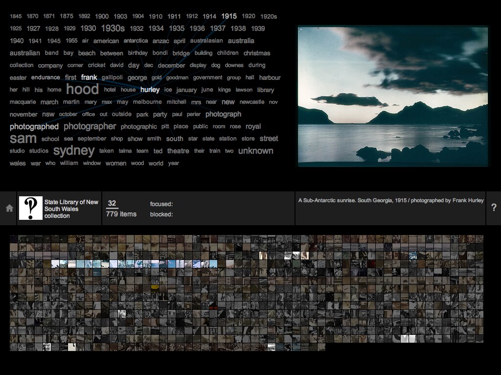
Dr Whitelaw’s proposal to remedy this problem is to show all the contents of the repository in one hit.

Yes it sounds crazy, but before pre-judging, check out his commonsExplorer app which lets you browse the public photography collections of institutions around the world. It’s impressive!

commonsExplorer 1.0

If we stick with the painting metaphor then, the “show everything” visualisation replaces Sidney Nolan’s Ned Kelly with Susan Sherrah’s Kaleidoscope – Land and Sea

Kaleidoscope - Land and Sea by Susan Sherrah

Can you believe I saw this painting in a tourist brochure at the hotel after returning from TedxCanberra? Talk about serendipity!

From the sublime to the ridiculous

While the “show everything” approach to knowledge management revolutionises browsing, I’m not sure how effective it is for deep learning.

In fact I find it a little bit overwhelming. From not enough information under the search model, to too much information under the “show everything” model, the learner is lost between two extremes.

We need balance, and the cognitivist in me believes we can achieve it via scaffolding. Practically speaking, this means categories and tags.

To illustrate, let’s return to my knowledge base example…

IMHO, an L&D specialist should have consulted the various SMEs across the business to identify the super categories that represent the sum of the knowledge contained therein. These would manifest as icons on the homepage.

Upon clicking an icon, the learner is presented with a listing of the assets tagged with the corresponding hashtag. In addition, sub-categories can be explored further to refine the listing, and so on and so on.

This may remind you of the Yahoo! Directory. This is indeed the concept, but in a workplace environment it is managed much more tightly for the purposes of the staff in the organisation.

The road well travelled

It’s old fashioned these days, but I still believe in the value of an expert guiding a novice.

I maintain the expert has an obligation to contribute their expertise to the knowledge repository, and to tag it appropriately. The L&D specialist ensures this happens efficiently through support and governance.

The repository becomes an open environment for the learner to explore at their discretion, yet is structured enough to guide their learning and form a mental model of the domain.

Learning theory geeks like me call this combining constructivism with cognitivism, and I think it’s really powerful.

The best of all worlds

Does my proposal preclude a search box? No.

Does it preclude a “show everything” visualisation? No.

In fact, I suggest including both on the homepage along with the category icons.

If the learner needs to find something immediately, they can search for it; if they want to browse the content, they can play with the “show everything” visualisation; if they want to learn deeply, they can dive into the categories and sub-categories.

It’s all the same knowledge, but with smarter design, it serves everyone.